Vegas Theater Company: Iconic imagery ignites imagination
©2016, freelance art director and designer
Overview
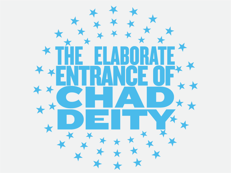
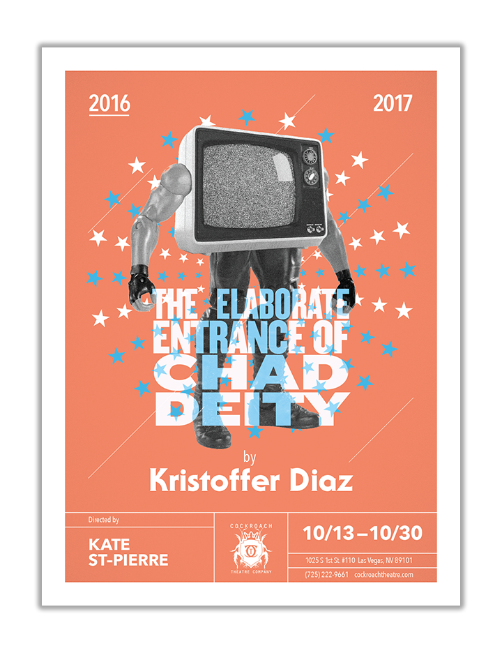
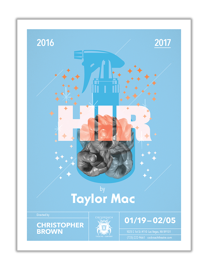
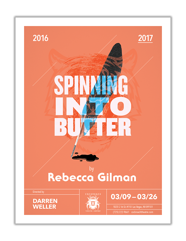
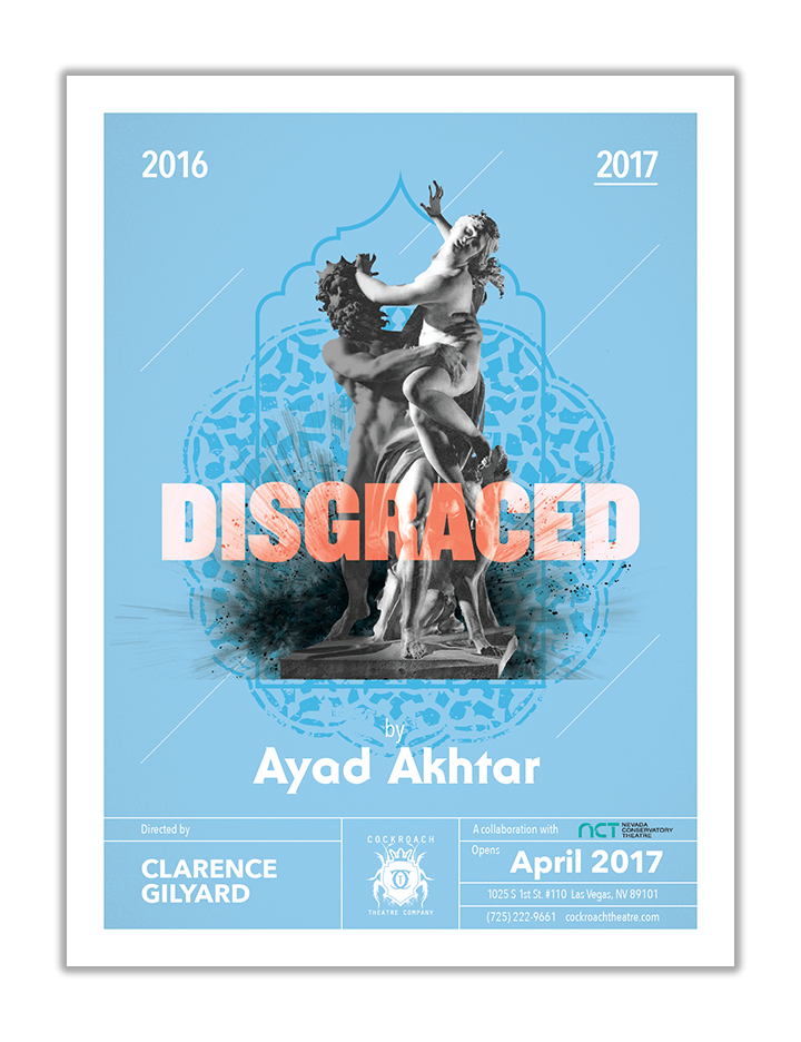
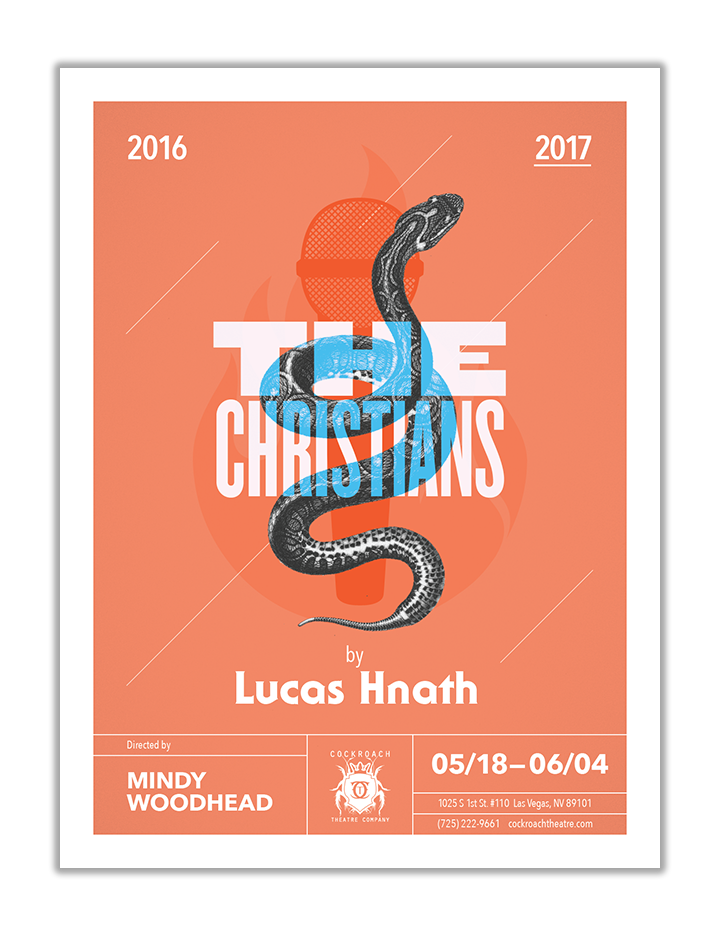
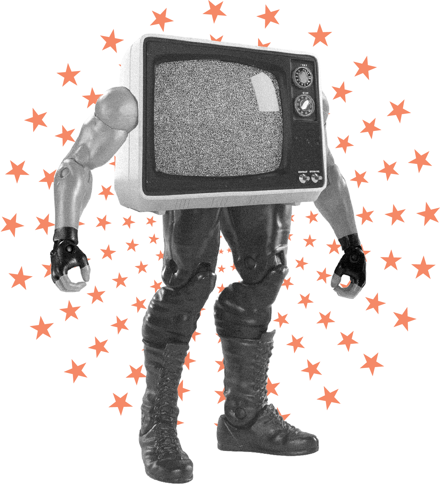
I designed a series of posters for the Vegas Theater Company (formerly Cockroach Theater) 2016-2017 season, visually communicating the central theme of each play while maintaining a cohesive series aesthetic that framed a unique hero image for each script.






A deeper look
Challenge
Art directed and designed a series of posters that visually communicated the central theme and message of each distinct play to potential theater goers. The challenge lay in creating individual posters that stood out while also forming a cohesive series. Additionally, strict usage agreements with showrunners and playwrights dictated specific ratios for the placement of copy, posing a constraint on the design layout.
Solution
To address these challenges, I thoroughly analyzed each script to identify through-lines and overlapping themes, ensuring both individual distinction and series cohesion. The visual approach combined recognizable photographic elements with clean shape overlays for an editorial effect, complemented by a minimal color palette to emphasize the hero images and typography. To meet the strict copy placement requirements while maintaining visual balance and a cinematic feel, I implemented a system of title blocks. This solution satisfied the usage agreements while creating a visually appealing and consistent design across the series.
Results
The resulting posters were striking, memorable, and versatile, suitable for both merchandise and advertising. Critically, the theater season itself was highly praised for bringing awareness to important social issues, including race, gender, domestic abuse, and mental health. This indicates the effectiveness of the posters in attracting attention and contributing to the season's overall impact
Creative Director/Theater Owner
Levi Fackrell
Levi Fackrell
Awards
AIGA Silver Medal– Las Vegas Work Show
AIGA Silver Medal– Las Vegas Work Show


