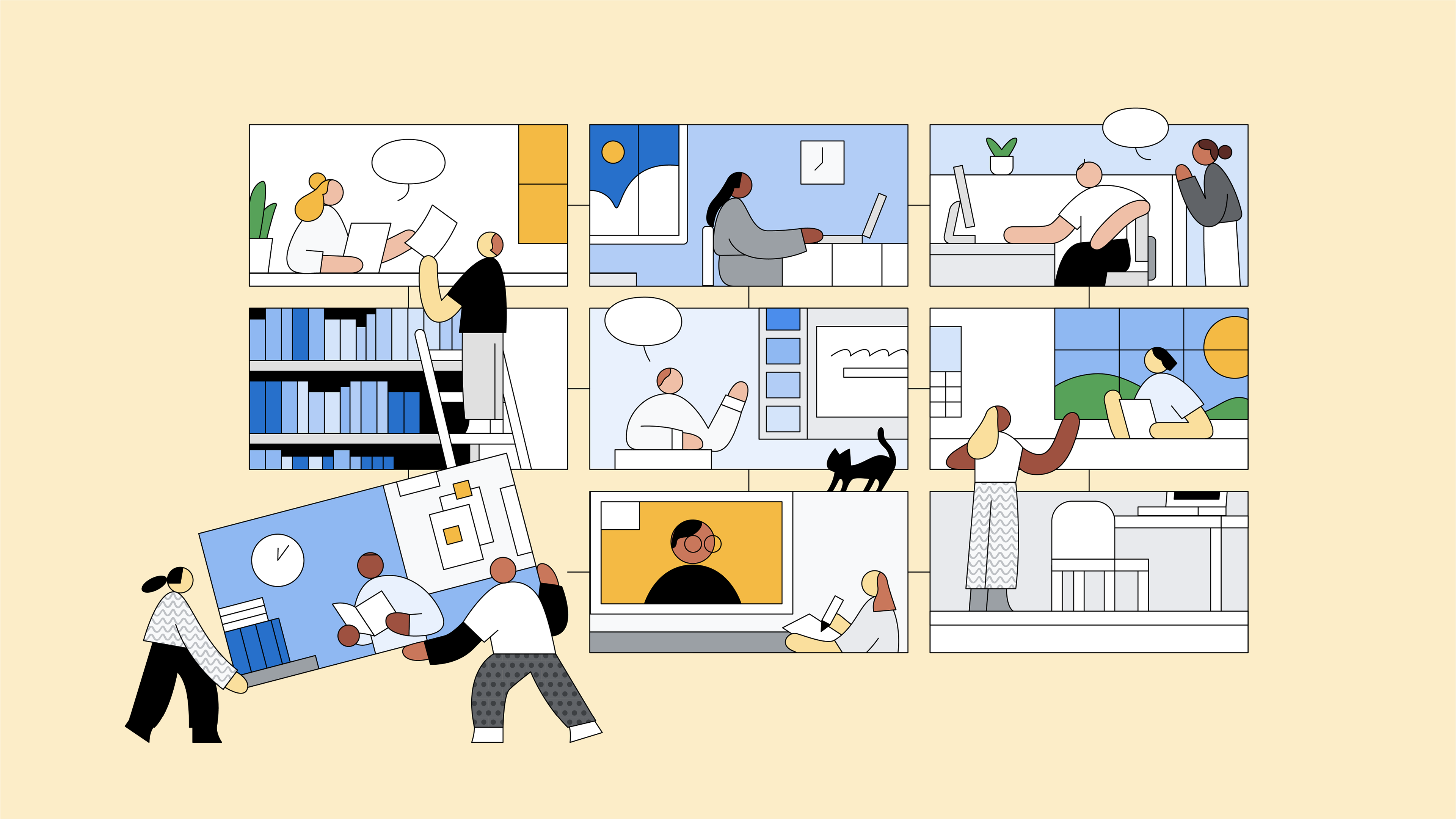
"Return to Office" hero illustration by Rose Wong
Brand Illustration: Building a flexible system in 3 phases
©2021, In-house
Overview
Leading the development and execution of a global illustration system for Google Cloud was a wild ride! The ecosystem had over 10 different illustration styles, confusing for producers and users. I created a new system that is consistent, cohesive, flexible, adaptable, and visually appealing, helping Google Cloud stand out as a brand.


The work was based on 3 principles: Focus on solutions. Build for everyone. Keep it simple.
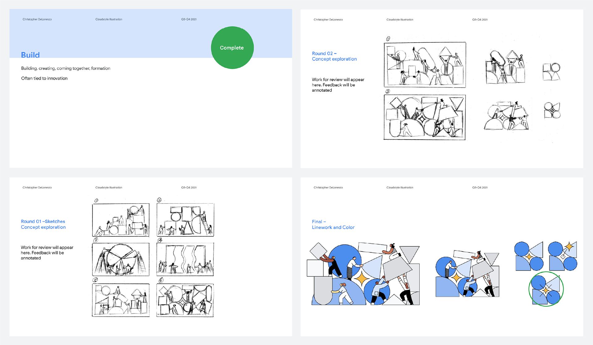
My role involved creating concept decks to spark illustrator creativity, providing essential context, and assigning tasks based on individual strengths. This iterative process, from initial sketches to final color, combined loose ideation with flexible art direction, ensuring scalability and adaptability.
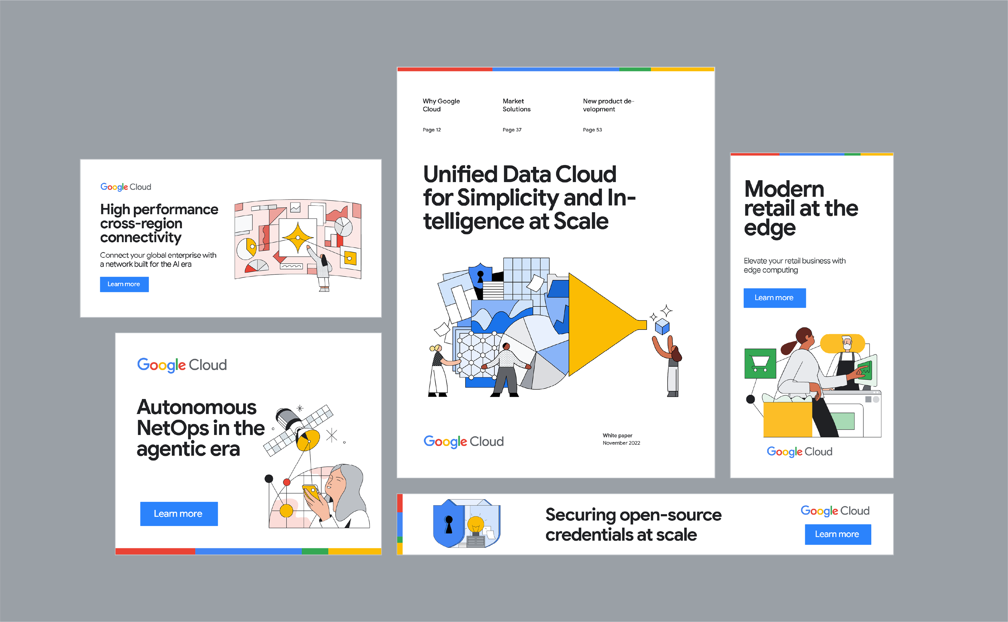
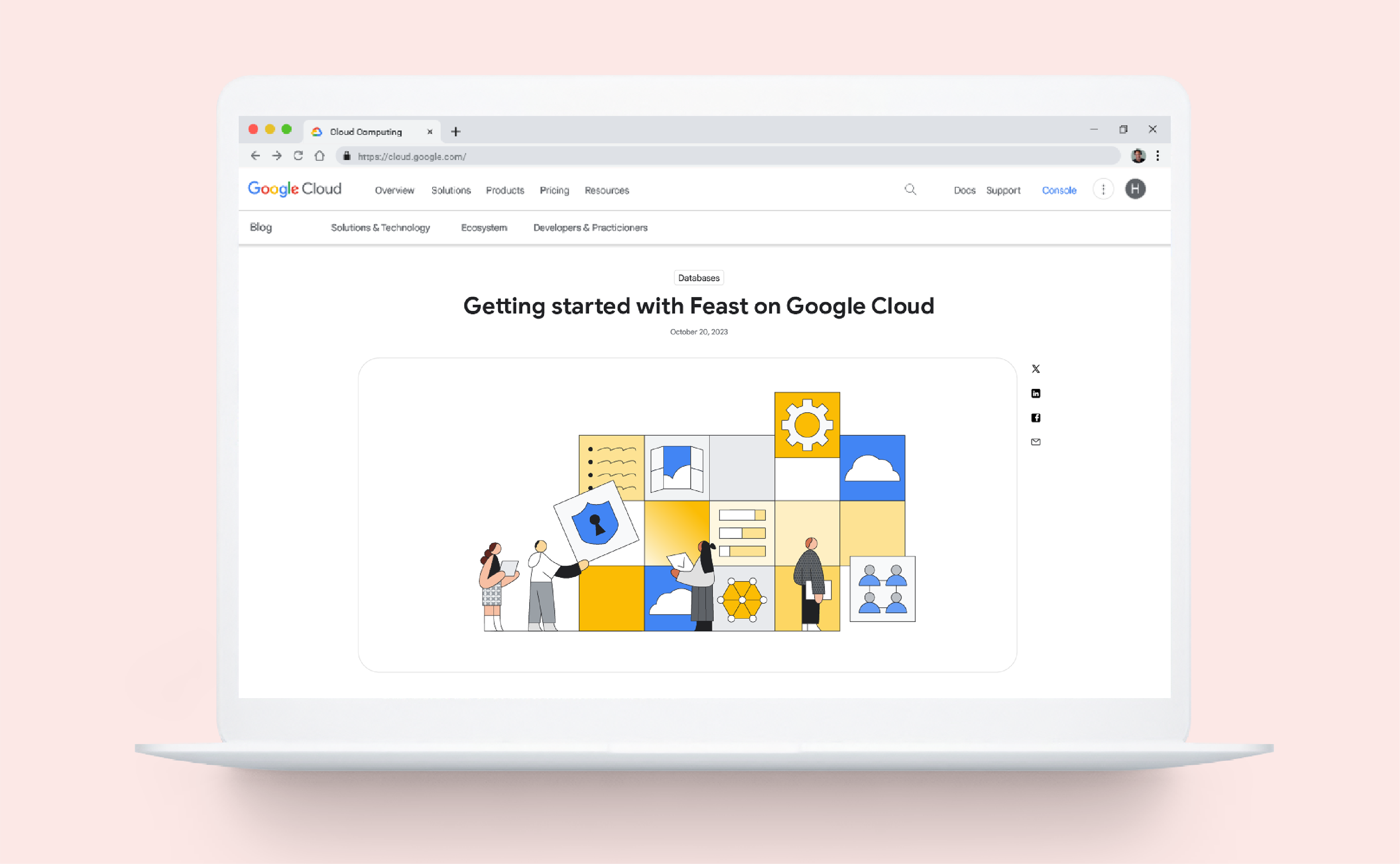
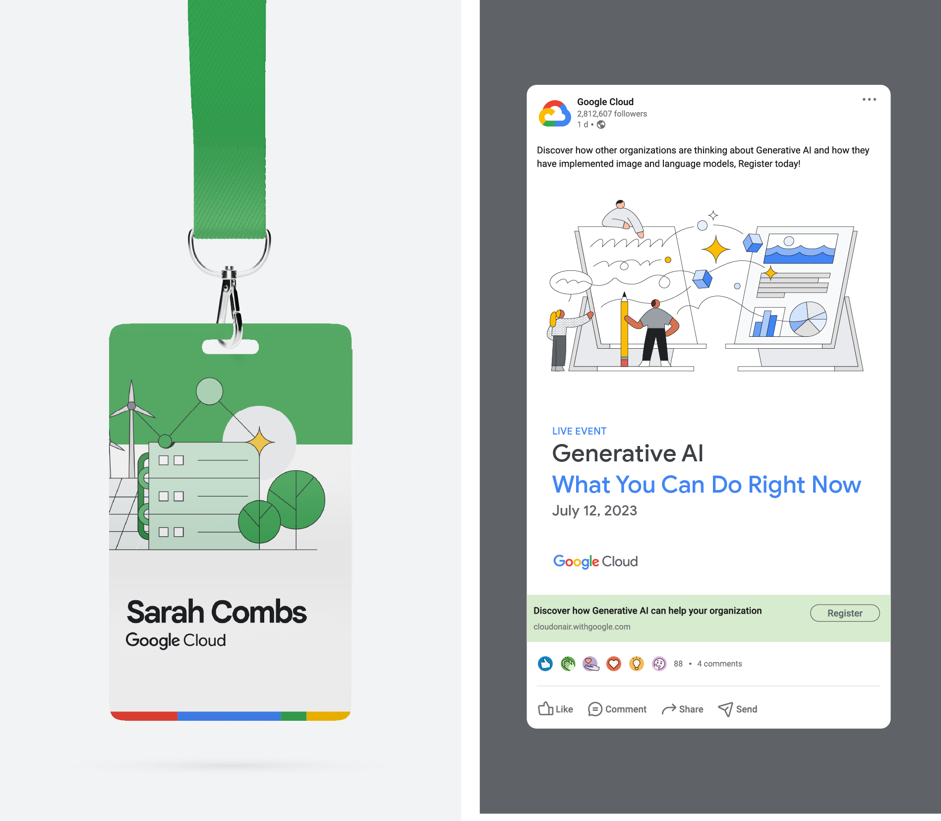
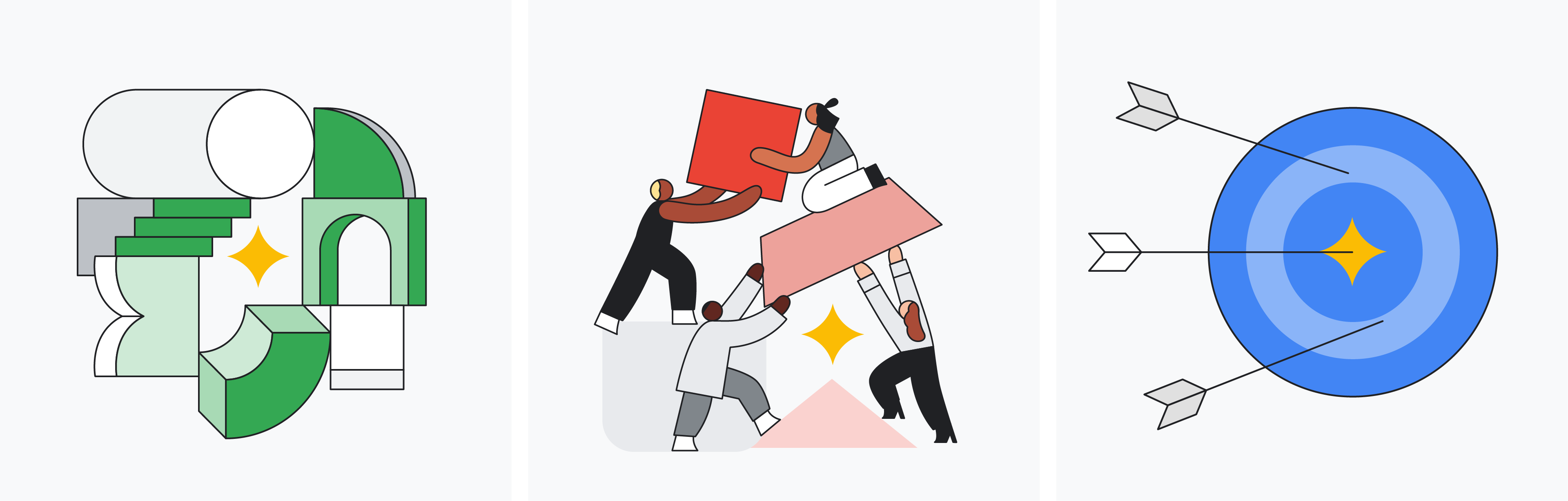
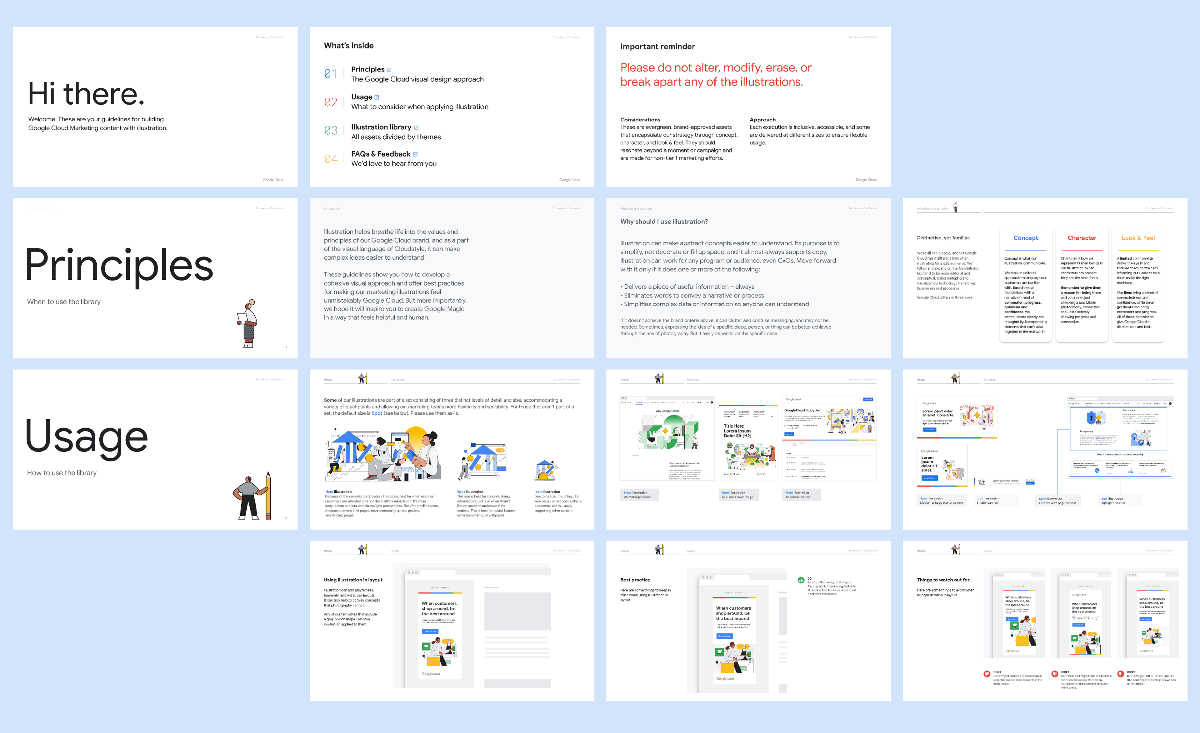
To ensure broad global application, I developed varying illustration fidelities for each conceptual theme. Hero illustrations delivered complex, story-driven impact for key placements, while spot illustrations provided quick context for social media and banners. Icon illustrations offered compact support for web content and documents.
To ensure broad global application, I developed varying illustration fidelities for each conceptual theme. Hero illustrations delivered complex, story-driven impact for key placements, while spot illustrations provided quick context for social media and banners. Icon illustrations offered compact support for web content and documents.

A Deeper Look
Challenge
To get started, I needed to secure funding to gather the necessary resources and launch my plan. My team and I developed a clear proposal explaining the business need and showing leadership why our plan was crucial. This led to a three-goal roadmap:
Improved communication: Make complex information clear and engaging.
Increased brand awareness: Build a stronger, more unified visual identity.
Enhanced user experience: Create a more consistent experience to boost customer trust.
Increased brand awareness: Build a stronger, more unified visual identity.
Enhanced user experience: Create a more consistent experience to boost customer trust.
Solution
I began Phase 1 by sharing our new style guide and examples with everyone, both internally and externally with 3rd parties and partnerships. For Phase 2, we developed an internal library to test out illustrations, identify what was effective, and adjust what wasn't.
To maintain efficiency, I enlisted both freelance illustrators and agencies. My own background in illustration helped me guide the creative process. In the final phase, I collaborated closely with leadership and experts to ensure the illustrations perfectly matched our themes and industries, then simplified them for clarity. I established clear objectives for everyone involved, and the visual identity was successfully established.
Results
Working with an amazing team, I built a highly useful and inclusive illustration library for Google Cloud marketers. It was a huge success—over 72% of internal teams found it highly beneficial, and we received over 700 requests for illustrations in just one quarter! We then teamed up with Apparent agency to add 90+ new illustrations, update the library, and smooth out any rough edges in the guidelines. This library now empowers marketers to be creative and launch campaigns faster. Since it was such a big project, I also set up a system with dedicated people to keep everything running smoothly and maintain the library's visual style long-term.
Executive Creative Director
Jeff Curry / Enshalla Anderson
Jeff Curry / Enshalla Anderson
Collaborators
Creative Lead / Taylor Goad
Motion Design / Jeff Miao
Program Managers / Sarah Trankle & Stacy Walsh
Illustrators / Rose Wong & Chris DeLorenzo
Agency / Apparent